There are a number of Photoshop tutorials that I would like to get through before the end of this course. I hope to learn some new skills while I create these images and I will reflect on them as I go through the lessons.
I know that a guided lesson aimed just outside my comfort zone is the best way for me to efficiently make use of my time. So, I have collected a group of tutorials (below) that are of interest to me both aesthetically and because I believe I have most of the material that is needed to create them. Turning my own photos into material that is functional in these pieces will be an effort in itself, but that’s what a challenge is for!
I have made a shortlist here (in no particular order):
- Shiny Retro Text [photoshoptutorials]
- Dramatic Moonscape [photoshoptutorials]
- Underwater Scene [photoshoptutorials]
- Create an Animated GIF [creativebloq]
- Double-Exposure [creativebloq]
- Refine-Edge Box Tool Explained [creativebloq]
So, I am going to try my best to create all of these images from scratch (ie. my own personal database). If there is a tutorial that requires an image I do not have then I will attempt to find one that is available to me through a creative commons license and I will be sure to credit the image in the posts to come. For now, let’s get going with my first lesson…
Tutorial 01_Shiny Retro Text
[Tutorial found here at: photoshoptutorials.ws]
For the most part, I followed the excellent directions given on Edmar Cisneros tutorial on How to Create Shiny Retro Text with Photoshop. There are a few places where I chose my own path, but those were not Edmar’s fault or due any disrespect. They were taken at my own preference.
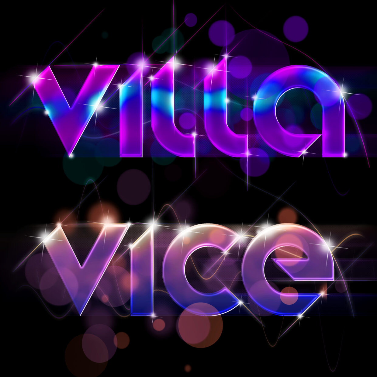
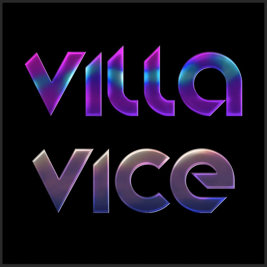
For text, I decided to make a little image for my friends’ and their villa which they live in part-time or they rent it out to tourists in Bali. I had already made a “Miami Vice” themed logo for them years ago which they used for some of the accoutrements of a stay at their villa. This time, I decided on a font (found in my system) called Stereofunk because it was chunky (ie. not too thin) and had a retro feeling to it. I also don’t like serif fonts. It’s personal.
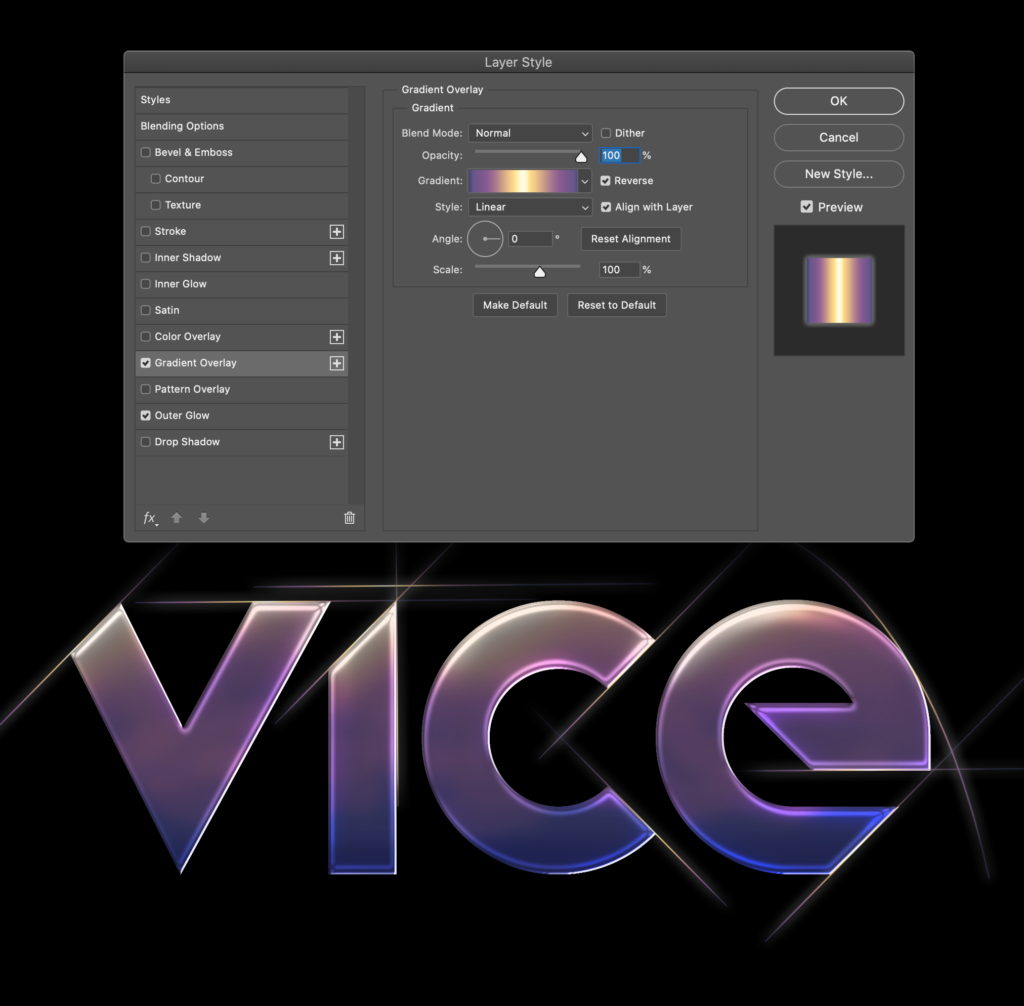
Anyways, I knew they had themed their villa in a vapourwave palette so I went to a really cool website called color-hex where I found all sorts of wonderful colour palettes, including the two I used for this piece, vaporwave neon purple (for villa) and Tropical Sunset Vaporwave Edition (for vice; see below). I used a fat brush with stepped opacity to cycle through the colours and create this blend.
My colour palette for VICE was Tropical Sunset Vaporwave Edition.
After getting to a look I liked, I followed the directions in Step 2 for the bevel and emboss (below). This was not a new operation for me.
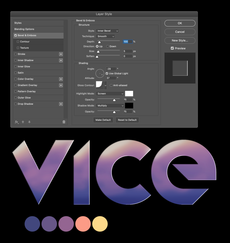
Going through the Bevel & Emboss stage of the tutorial
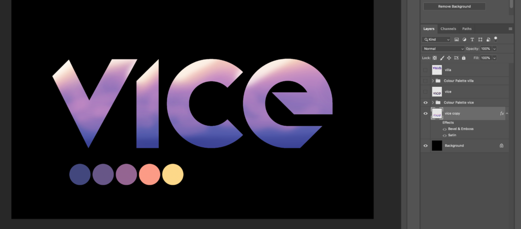
Next, on to the Satin stage (image below) of Step 2. This was admittedly my first time consciously using a satin overlay and it was a cool effect. It adds some highlights around the edges that react to the ambient light (photoshop calls it “Global Light”) and add a new layer of texture to an otherwise flat letter (or object). In the very next step, I will find out how to bring out the highlights even further…
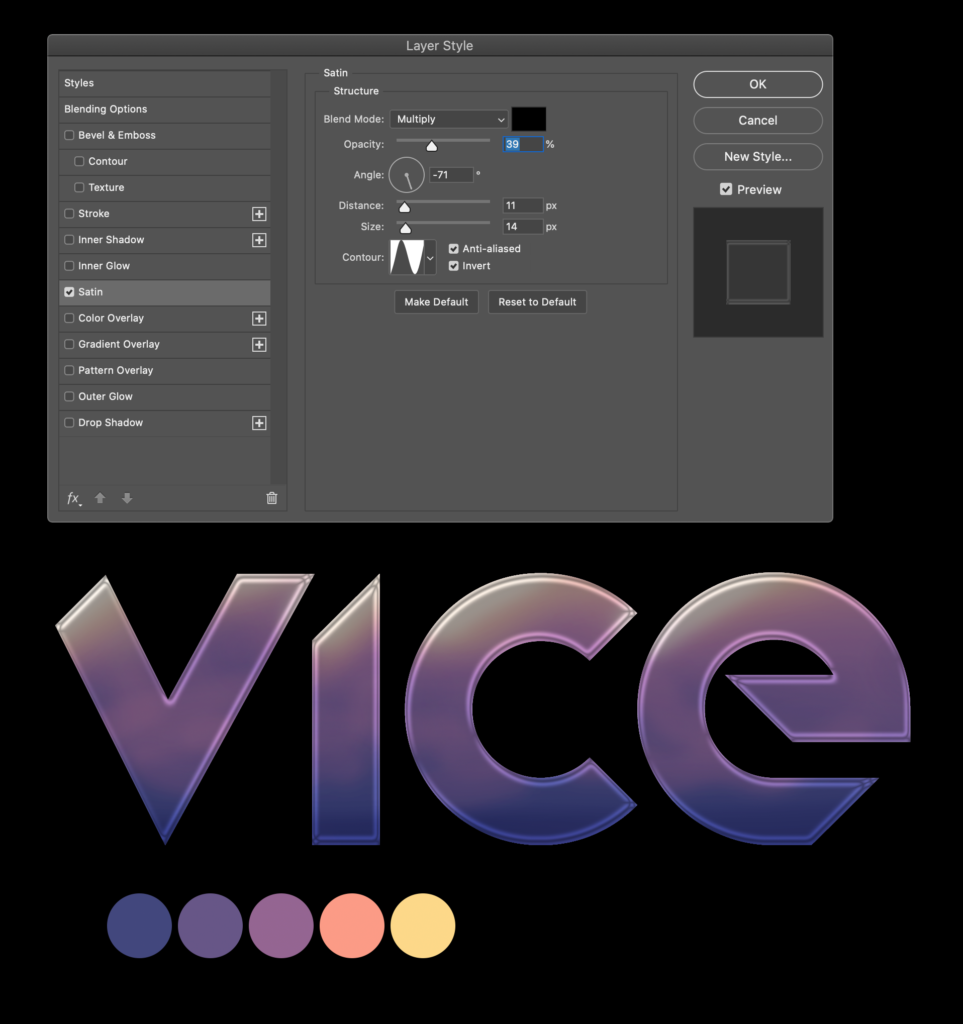
My first exploration of the satin overlay.
At this point (Step 3) the tutorial took me through an extra stage that was designed to bring out the highlights of the letter by using the Dodge Tool. I quickly learned that it wasn’t just a tool that took up space on my toolbar, it actually boosts/dampens the lighting of your subject. You can choose midtowns, darks, or highlights (like we did here; below) and then use a modified brush to alter certain target spots. Before using the Dodge Tool on the text, we had to flatten the image (or the tool would have no effect on the alternate Satin layer effect). I was sure to copy and save the original layer in case I had trouble in the future. I have learned this through countless tragedies.
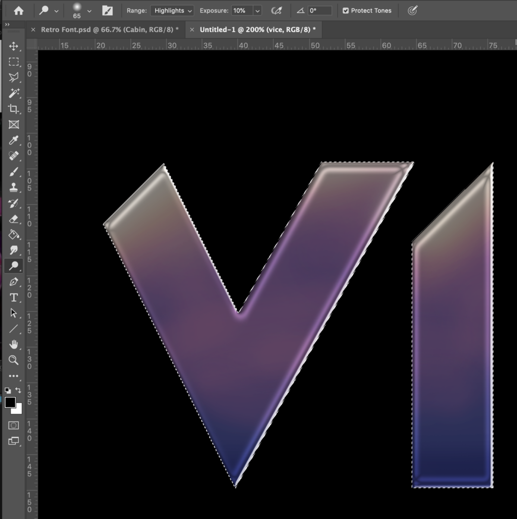
Using the Dodge Tool to bring out the highlights of the subject.
Anyways, the highlights started to pop and the words seemed to glow a little. As instructed, I also boosted the brightness and contrast through an adjustment layer (below). Nothing new here.
Fully coloured and boosted with a layer adjustment to brightness/contrast.
Step 4 of the tutorial was a clever idea that I hadn’t thought of. It not only saves time, but it adds a depth of colour to a glint of light that is much more realistic than a white “slash”. I had certainly tried to add bling or shine to objects before, but I had never thought of creating a brush line and adding a gradient to do it! Then, for efficiency, simply replicating and altering the size as many times as needed. Brilliant.
Here is how I copied and angled the original brushstroke to -45 degrees and shot them off the side of the two Ls in VILLA (below).
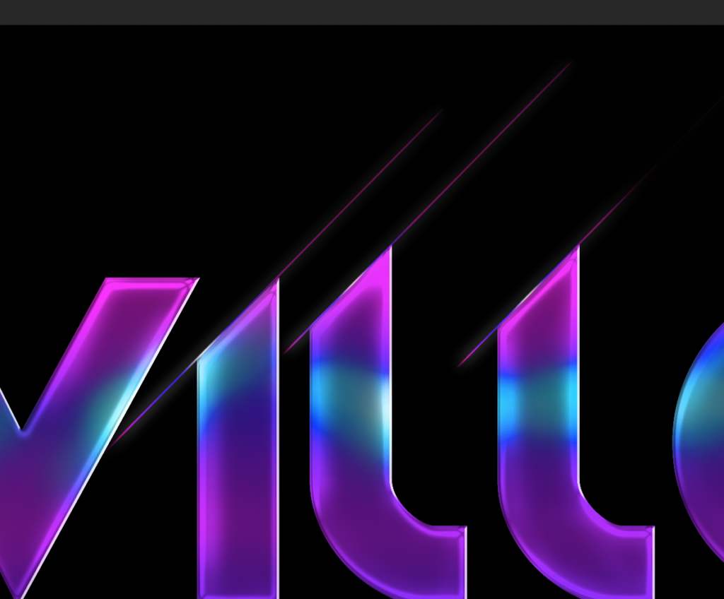
Adding glints of gradient light to the edges of the letters.
After finishing up VILLA, I moved on to VICE, being sure to apply new colours to the gradient fill (below). There were a couple spots where I used Free Transform to bend the light around a curved surface (ex. right of the E).
Applying a new gradient to the original brushstroke.
Step 5 was clever and fun. The tutorial had me copy the layer, drop it underneath, and then add a Motion Blur to it (below). The effect, as intended in this case, looks like further gleam from lights and the blurriness adds to that 70s feeling of soft focus, glitz, and glam. It could certainly be used to make an object look like it’s in motion, but that’s not all it’s limited to! New skill acquired.
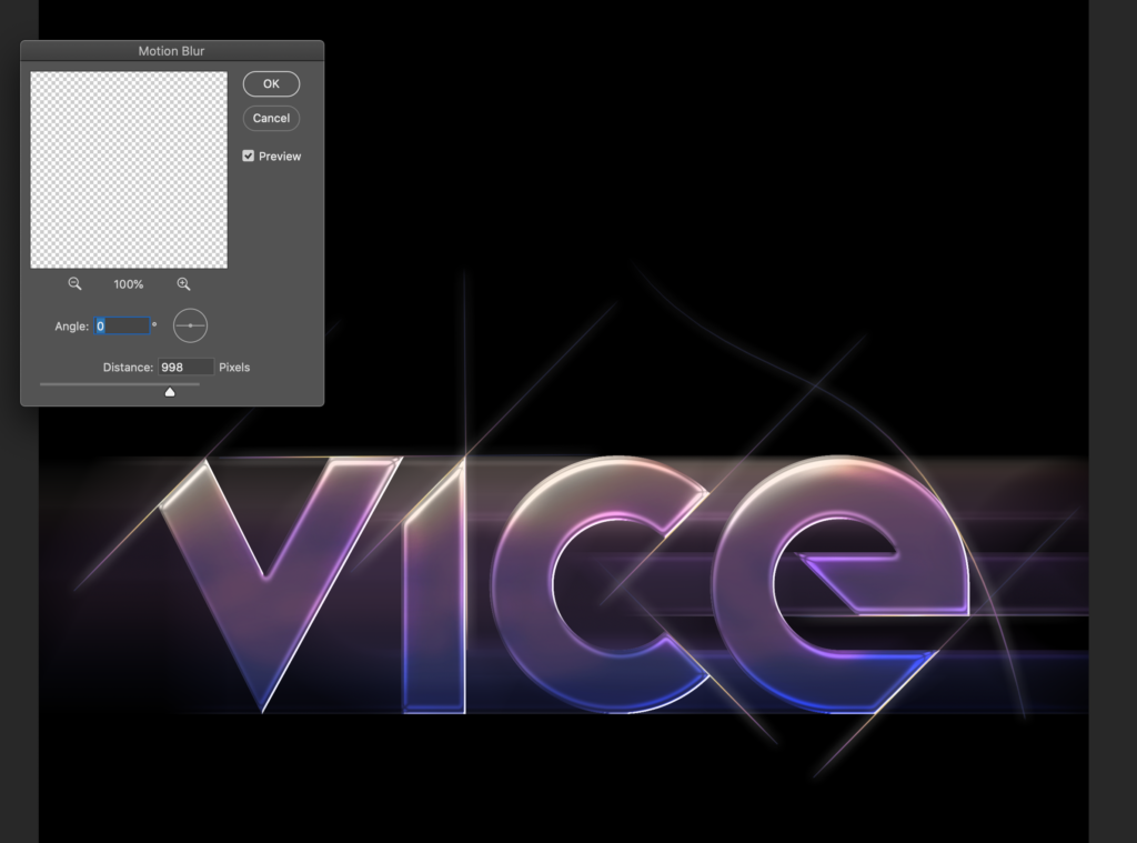
Adding a Motion Blur filter to VICE.
In Step 6, I used a soft Brush Tool to add “light bubbles” along the edges where I expect there to be some light play (below). As stated in the tutorial, I used two sizes and aimed for the lightest areas of the letters.
I also added some small “light crosses” to each bubble using the same copy and paste technique introduced in Step 4 (above). You won’t be able to see evidence of these until the next photos.
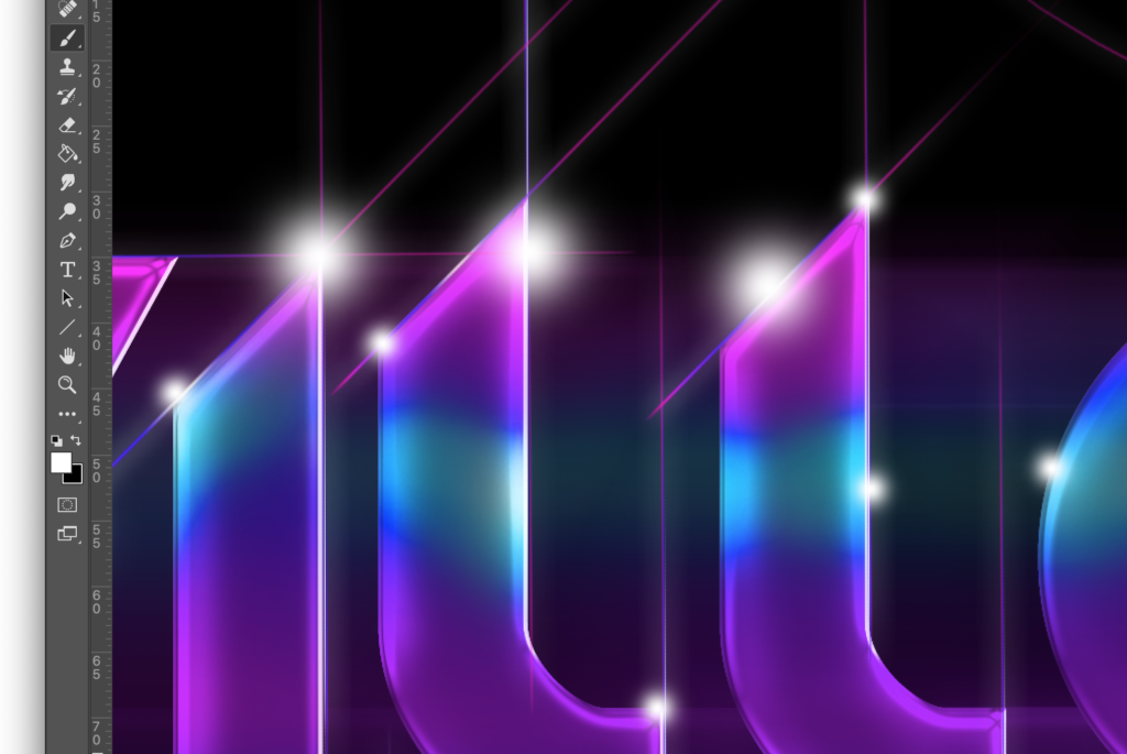
Using a soft brush to add light bubbles on the edges.
I’m not totally sold on Step 8, creating glowing waves (below). Well, let me put it this way. I am happy to have learned something new, but I am not sure their addition really added to the success of the overall image. In fact, the waves might even add a layer of chaos that isn’t needed. Weigh in with a comment below this post if you have an opinion.
The waves are made up of a cool gradient overlay and, with the added glowing effect, they look almost like tubes of neon. Or perhaps, more gloomily, like an erratic ECG.
Anyways, now they exist in this image. Should they…?
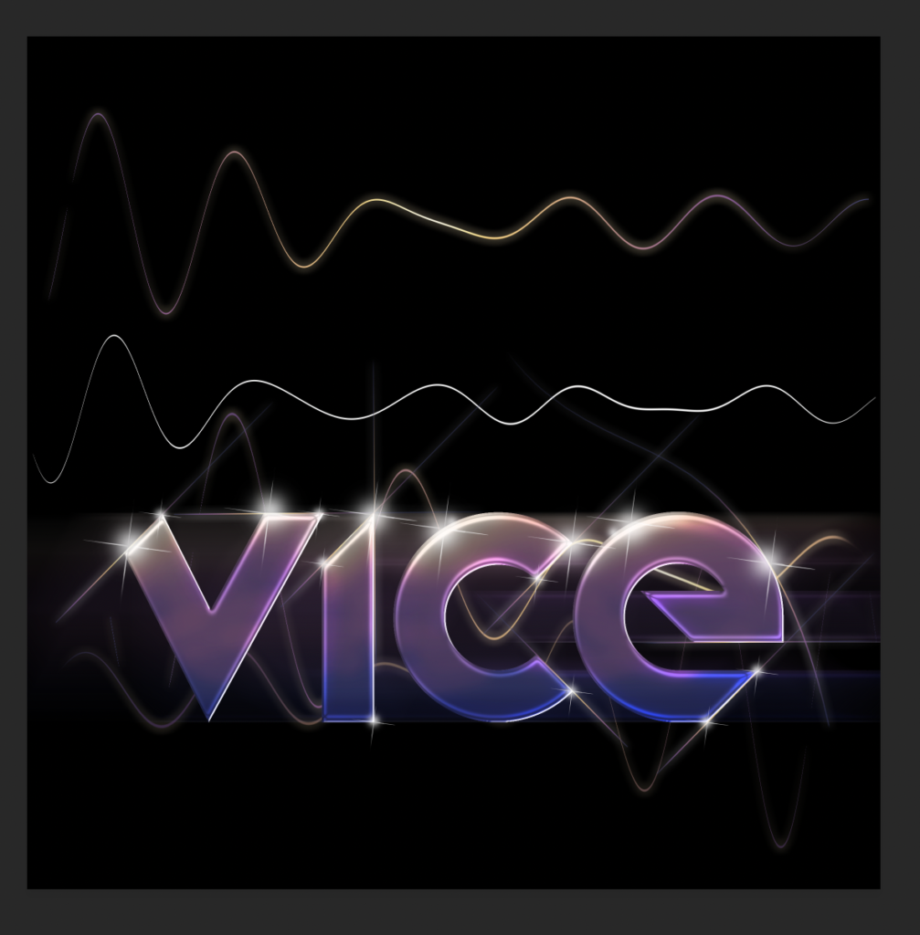
Creating sine waves with a gradient overlay.
In the last step I added a bokeh effect to each word. While VICE came out looking good quite quickly (below), VILLA took quite a while. I think it was due to VILLA’s brighter colours. They were harder to blend with the image and I ended up dropping their opacity quite a bit more than I did for the effect on VICE.
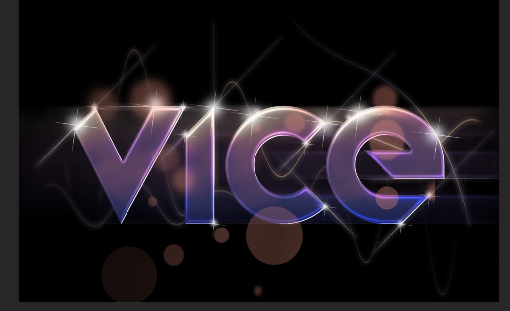
Adding the bokeh effect to the word VICE.
Finally, I followed a few last instructions from the tutorial in order to make the colours pop a little more. You can see the Levels toolbox interface on the right of the image below.
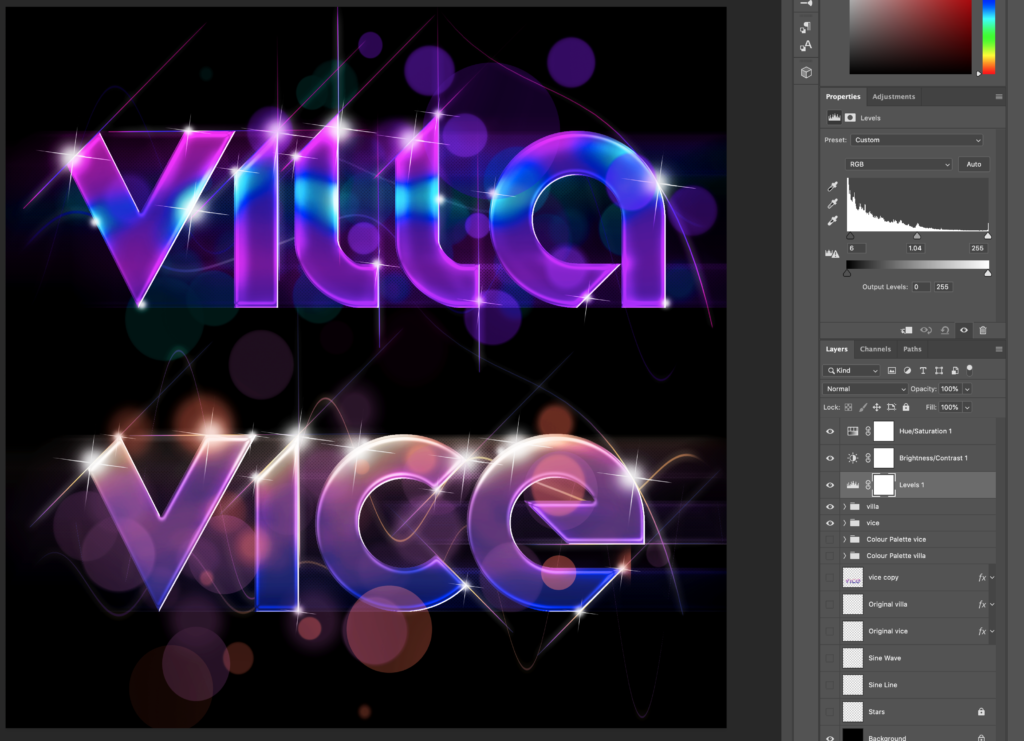
Making some final layer adjustments to the overall image.
You can see the final image in the featured spot of this post above. My friends also have a high-quality version. Will they use it?
Next attempt? The Underwater Scene…