Consistent with other phenomena of daily life, my second tutorial took me a lot longer than expected. I was hoping to finish it within a couple of days at the end of Reading Break, and I was close. But to be honest (in the interest of best practice for a self-reflection) there were a few finishing touches (explained below) that I only just completed two nights ago.
Admittedly, there was a two-week gap of stasis in the middle so it isn’t really fair to put the time for this project at 18 days. I would say it took around 10-12 hours, including the finishing touches and the screencast (below). There was also a blatant error that I didn’t catch until it was almost too late…
Just a reminder that moving forward I am attempting to be pretty strict with the material I use to create my own work (see my last post, Shiny Retro Text, for my first explanation of this topic). I have been a little loose with copyright in the past and I want to make an effort to develop artwork from scratch without having to use other people’s material. This new mentality has completely changed the way I take photos. I am now looking to acquire stock shots when I am out with my family. Sailboats, leaves, grass, snow, etc. Any of these shots might help a future project and save me from having to pay/acknowledge someone else to share theirs.
Under these new parameters I have created this entire piece with my own material.
So, without further ado, here is my attempt at Adrian Scheff’s tutorial Create an Underwater Scene of a Giant Goldfish in Photoshop from photoshoptutorials.com…
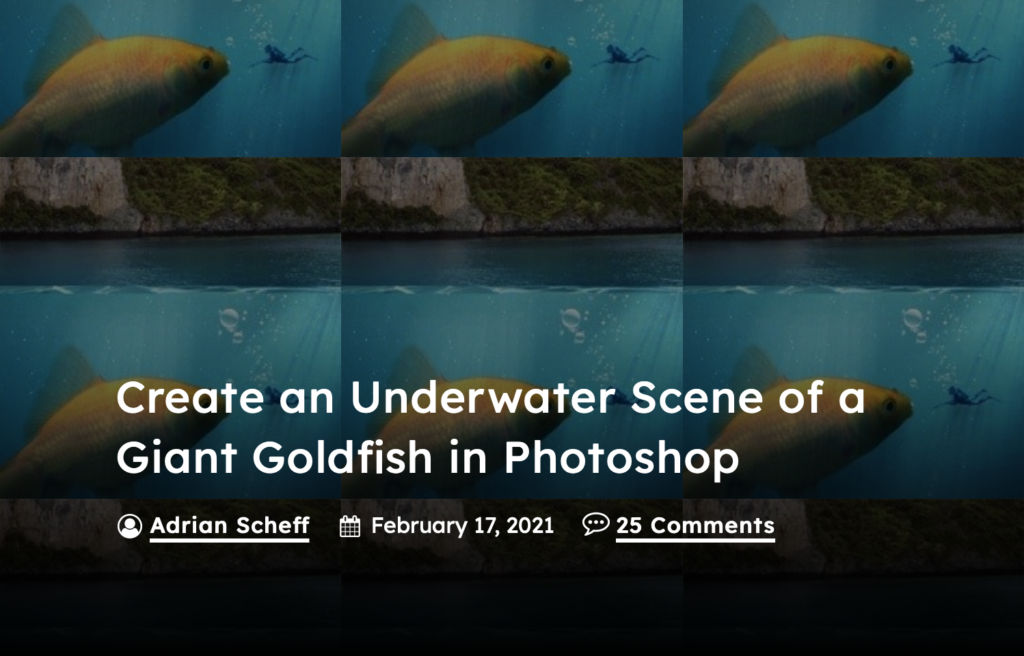
The title banner from photoshoptutorials.com
Adrian Scheff provides a list of the images that he used in the tutorial as free downloads, but I skipped that part and supplemented my own. It took a lot more work to prep each part, but it was worth it for me.
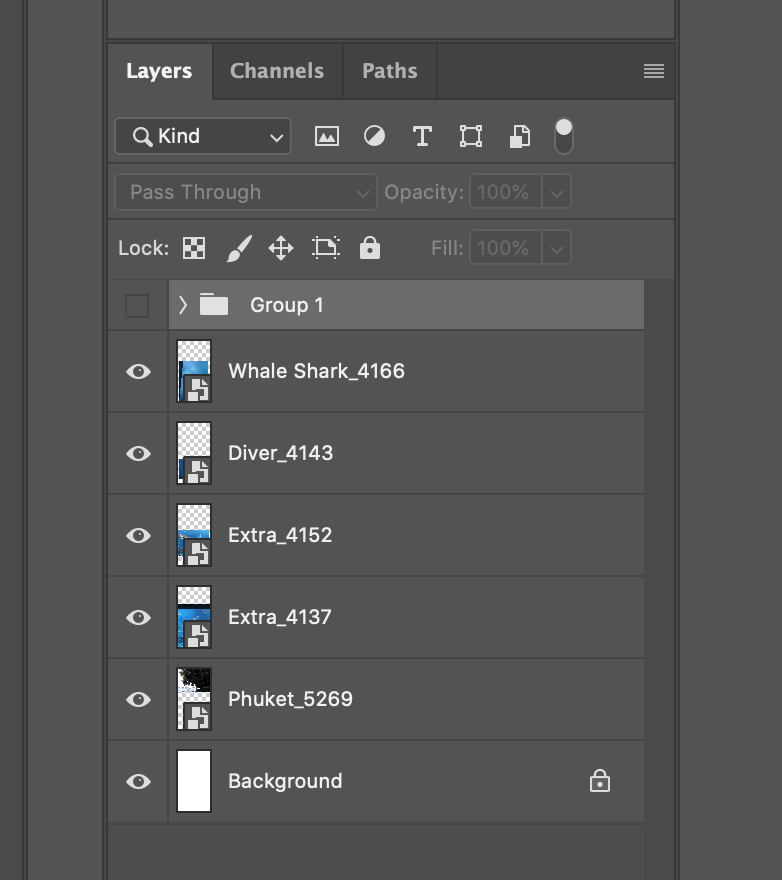
My initial file import as layers.
- Whale Shark_4166 is a photo from Okinawa Aquarium (2017) and will replace Scheff’s goldfish in my scene.
- Diver_4143 is from the same aquarium and will be used to replace Scheff’s diver.
- Extra_4152 and 4137 are both from the same aquarium and were intended to be used to patch and fill space if needed.
- Phuket_5269 is a photo from a kayak trip to the Gulf of Thailand (Wikipedia) from 2009 and will be used to replace Scheff’s “Island Pack”.
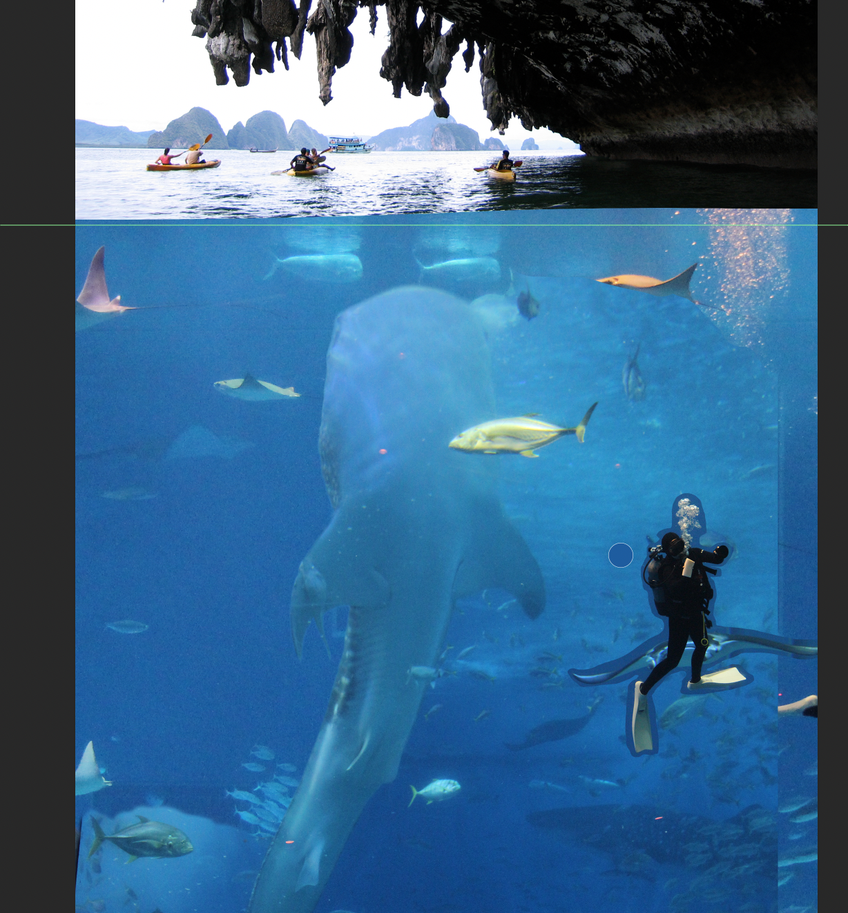
Getting a feel for the position and balance of the image.
After import, I did some rough masking on each layer and started to move them around the page to get an idea of what the final image would look like. Since the orientation of my whale shark didn’t match Scheff’s goldfish I had to come up with a new story. I decided to aim the shark for the kayakers on the surface while the diver swam in the foreground, oblivious to the impending doom behind them.
The light source of my image was going to be different, too. You can see from the surface of the water that there is more light on the left of the image, while the water is somewhat shaded on the right. I made a mental note that this would affect the way the light would hit the water and play on the creatures below.
The green line that runs through the central horizon of my image is a useful levelling device that PS has built into its software (they have vertical ones too). It is not part of the final image but I used it to give me a static definition of where the waterline would be.
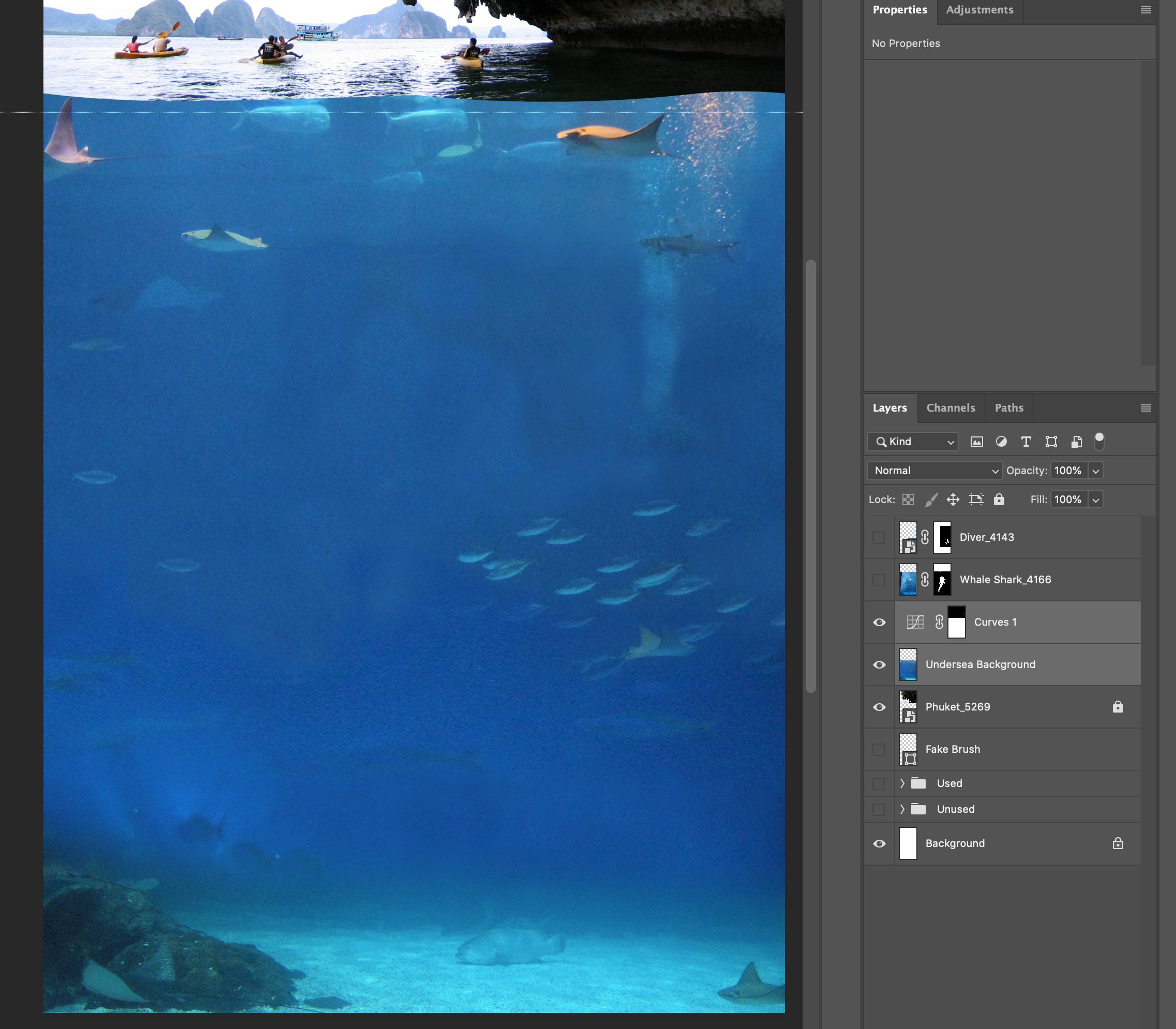
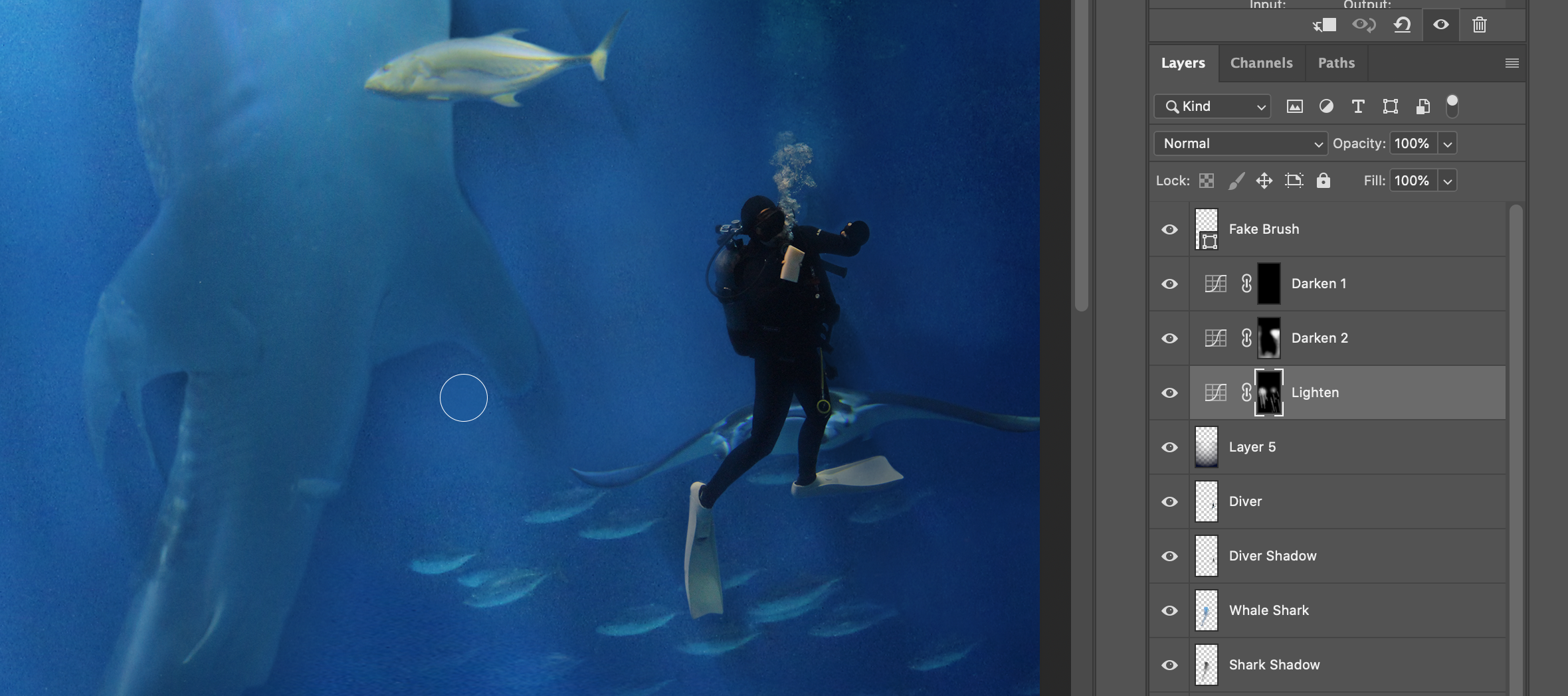
Bringing the underwater layers together and darkening.
This was a crucial step in my process because I had to “commit” to the layout of the underwater portion of the image. First, I fine-tuned the layers so they were positioned the way I wanted. Note the bubbles in the top right – I have already decided where I am going to put my diver, too.
Also note the same green bar in my workspace. Now the waterline is starting to take shape.
Consolidating the layers also allowed me to blend them into one layer that looks more seamless. I wouldn’t have had to do this if I had used the free download material in the tutorial. Instead, I had to spend a lot of time “washing out” the human signs of the aquarium behind the fish (walls and windows and boxes all look distinctly out of place in the pristine waters of the South China Sea).
Moving into one image will also allow me to manipulate the image cohesively and be confident that it will respond to further changes in the same pattern rather than as different layers. I still have things to clean up, but this is good for now.
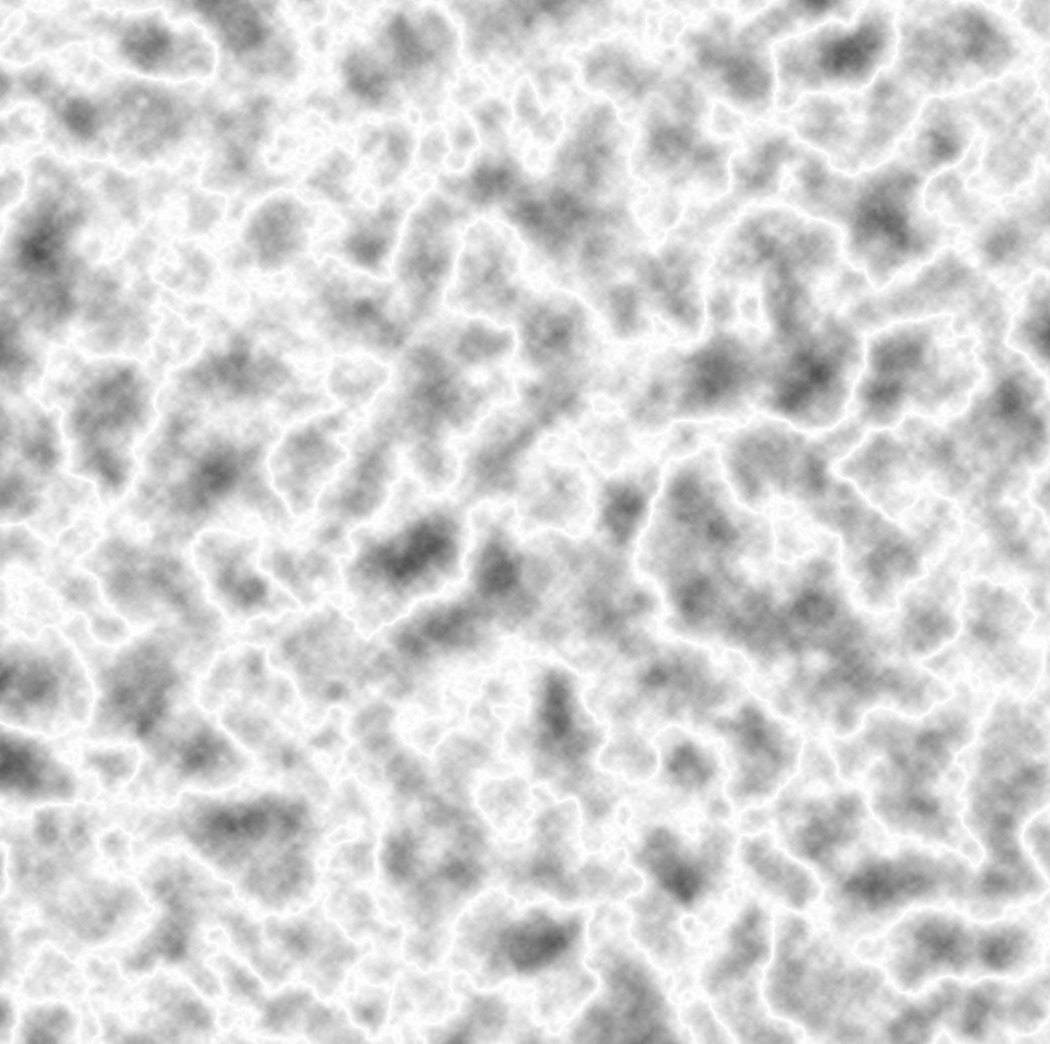
A nifty trick from Adrian Scheff!
This was certainly the coolest part of what I learned from the tutorial. Well, it could have to share the top spot with the lighting masks he uses later. I really liked the lighting trick too (and it will probably be more practical for me unless I end up working on a lot of undersea compositions). Anyways, this part was cool and it was created from scratch!
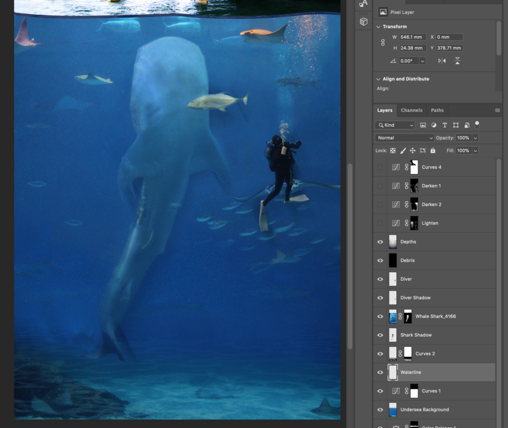
First, Scheff begins with a rendered layer of clouds, filters that through a “difference clouds” layer, uses control-I to invert the colours, and then adjusts the levels to draw up the contrast and make a really cool effect. You can see the same square (above) in the following image (below) on the sea floor after it has been through the levels adjustment layer.
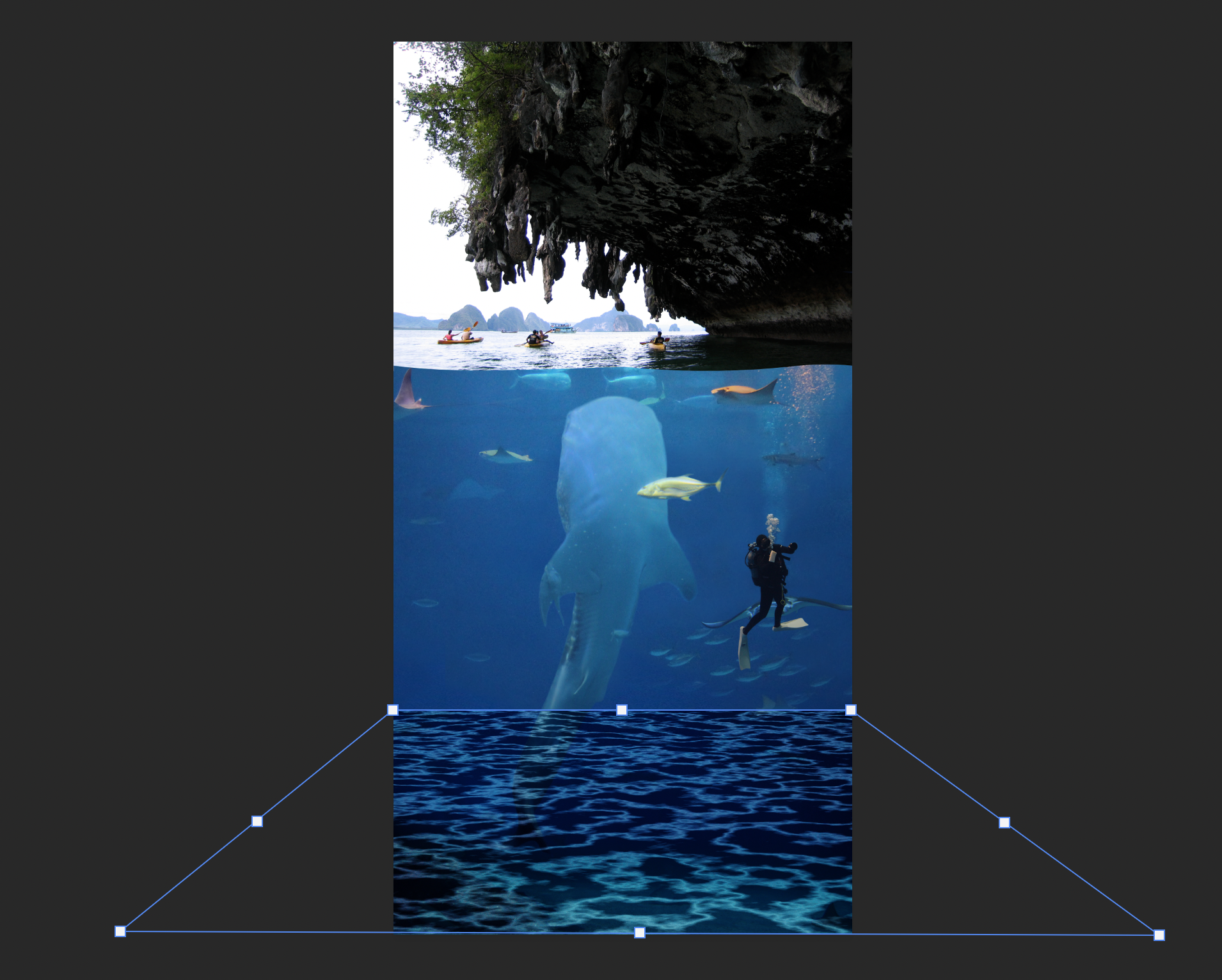
Scaling the seafloor lighting effect.
You can see the altered square in the bottom of the image highlighted in a blue outline with white vertices. I have just scaled it using the perspective tool in free transform. It still looks a little overwhelming here but you can get a good idea of how the effect is made and then set in place.
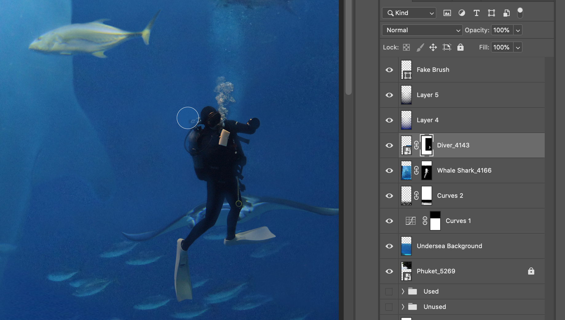
Brushing in some transparency to the diver.
It is a step like this that I just love having my tablet and a stylus. Unfortunately I cannot give you. link to the product I use because it is not in production anymore, but it is a sibling of the Wacom Intuos line.
From the layer tab highlighted on the right (Diver_4143) you might notice that I have added a masking layer and I have used my brush to fine tune the edges. In this screen grab I am using the same brush, expanded to a larger size, and set to an opacity of about 5. This allows me to brush away layers around the edges of the diver. Although I am technically making them more transparent to the background it has the appearance of more water in the foreground that clouds the lines and some of the equipment. I used it on the flippers and the tank and other lighter surfaces to enhance the effect. I had to play with the bubbles a little bit, too. As I hoped, the bubbles from the diver do line up with the other ones I left in the background.
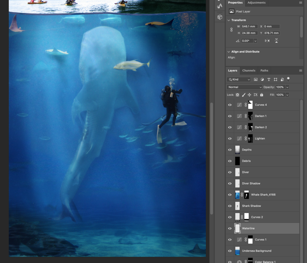
Playing with the light.
This screen grab shows the trick I was referring to above – my favourite. I say “trick” with an acknowledgement that this could be standard knowledge in PS 101 but I had never come across it before. Scheff taught me to create three different curve adjustment layers (of differing shades) and then fill each layer mask with solid black. Then, using a white brush, I set the opacity to around 15%. This required more work than a brush with a higher opacity, but I had more control.
I changed sizes of my brush depending on the spaces I was attending to. You can see in the screenshot (above) that I adjusted the size of the brush to work on details around the features of some of the larger creatures.
And there was still a pretty blatant mistake right in front of my eyes that I still hadn’t caught yet…
Oh! I almost forgot because I didn’t document it with a screenshot – there is also a step hidden in there that created a gaussian blur layer below the whale shark and diver layers. You can see the blur best in the image immediately below this paragraph (Flat). Basically, it involved duplicating the layer and filling it with black. Making sure it took the lower layer and then adding a Gaussian blur. Finally, I went in with an eraser and took out some of the “shadow” that was created in areas that should be well-lit. Another wonderful task to devote to the stylus. Anyways, I think it was clever and I appreciated learning it. I think it is adaptable and it was good to play with a blur layer a little bit.
Flat.
Lights!
The two images above show the difference between the same undersea detail with and without the lighting layers that were just added. I think they go a long way in adding some real depth to the underwater world.
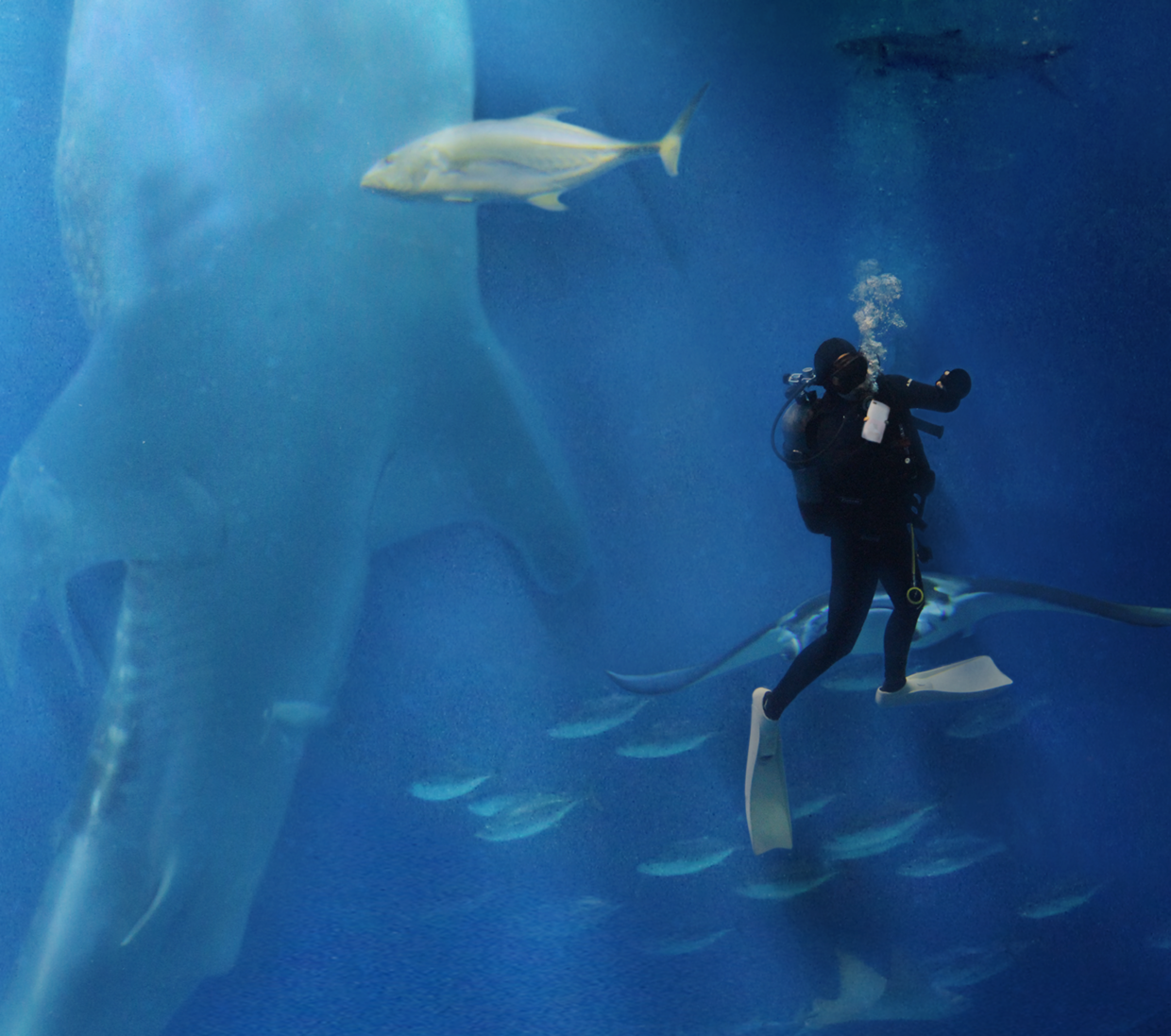
Caught it just in time… for an underwater selfie!
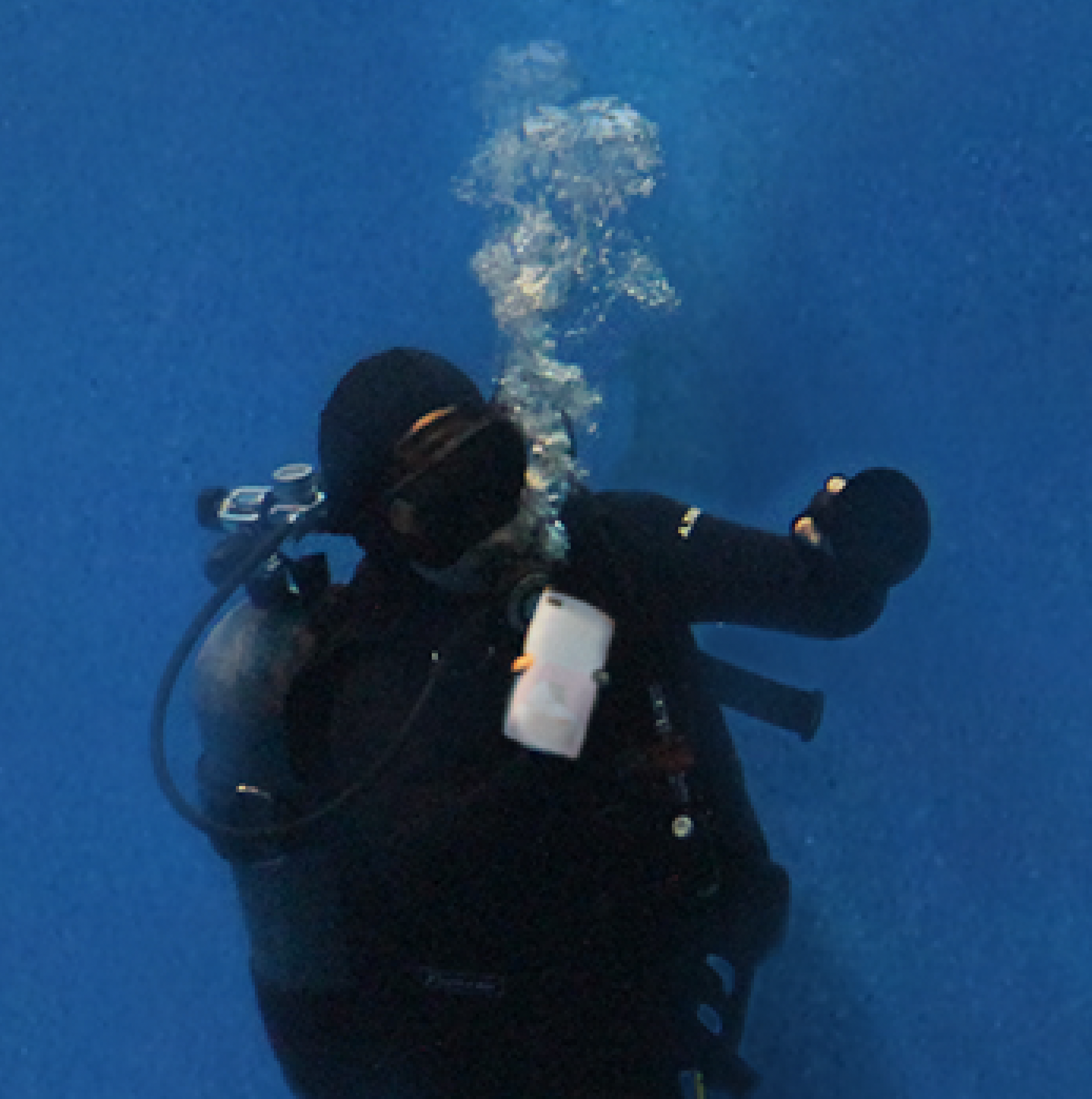
As I was cleaning up and auditing my excess layers in preparation for a screencast, I realized that my diver was still carrying their sponge! That wouldn’t do – our diver hero couldn’t be diving in the South China Sea looking to clean some glass! Honestly, it just came down to where the diver had their hand positioned and it kinda reminded me of the position someone might use to take a selfie in front of a massive whale shark. So, I dove back into my photos and found some shots of the crowd at my son’s pre-school Christmas celebration back in Taiwan in 2017. One of the moms in the front row was taking photos of her child during the show with a Hello Kitty cover on her mobile. Bingo.
Then I smudged out the Kitty for copyright reasons. What a satisfying way to finish a creation.
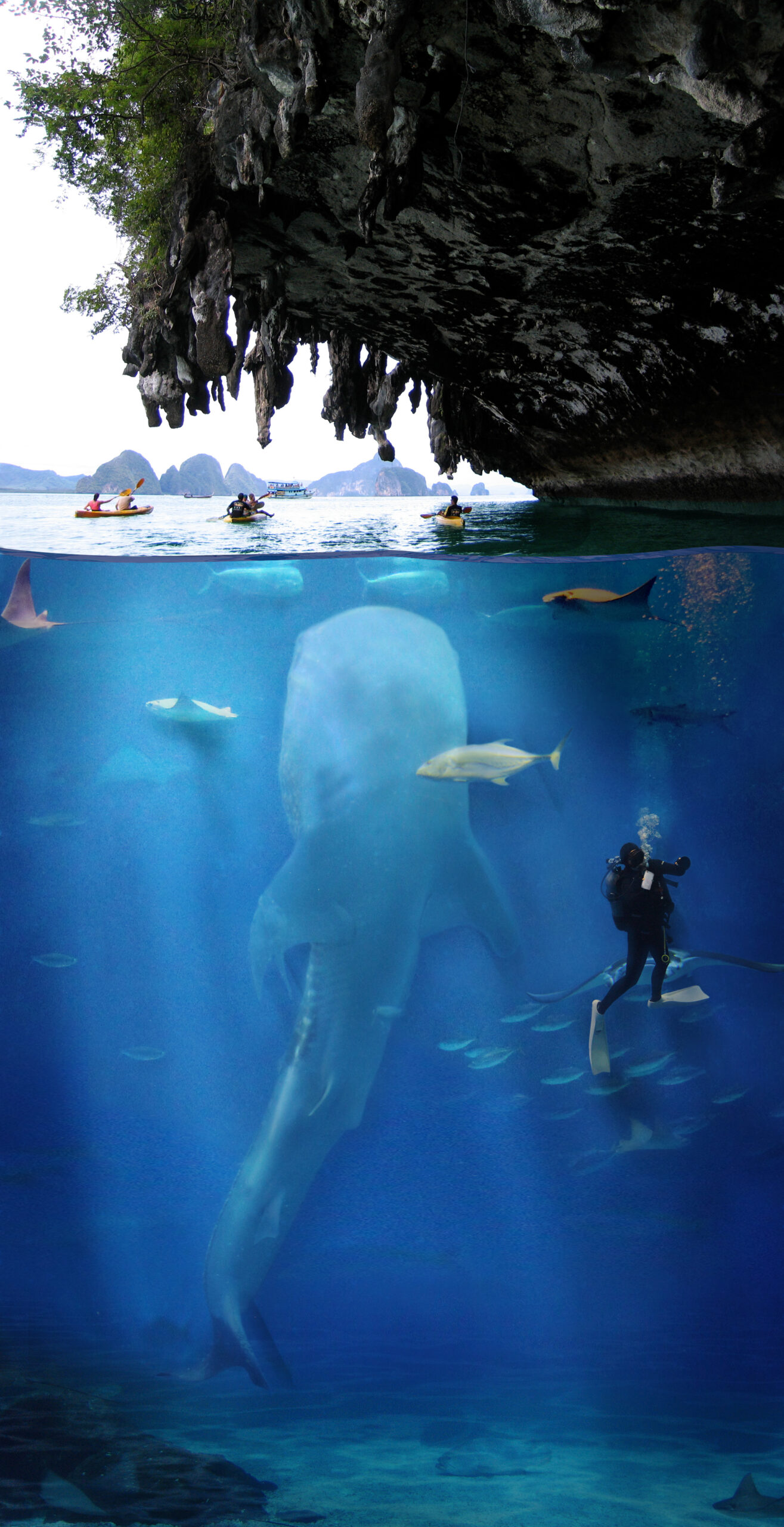
My final submission.
And there’s a post script…
If you are interested in taking a tour through the different layers I used and the effects they had in both the composition and the final image you can watch the video posted below. It is my first screencast and I kinda just jumped right in.
Upon reflection, I think I would tighten up the script a little if I were going to redo this screencast or feel the urge to publish another (actually, I can see Emily and I using it for an exploration of FreshGrade if we do get permission to dig into it).
If I really wanted a professional production, I would also think about recording the audio in post. But, doing something like that usually opens a whole can of worms in terms of production quality and I just wasn’t prepared to put that kind of work into this first effort.
To be honest, I got what I wanted to out of it. I learned how to record my screen and make a screencast. Boom.
risingtideteacher 17/03/2021
This is super cool!!! Nicely done, it makes me excited to use this:)